
Adobe Patents a Tool That Strips Illustrations Down to Fewer Colors
Anyone who has inherited a vector illustration bloated with dozens of near-identical shades knows the tedium of cleaning it up by hand. Adobe's new patent describes a tool that does that job automatically, in real time.
What Adobe's color-reduction tool actually does for designers
Imagine you open a logo file someone sent you and discover it uses 47 slightly different shades of blue. Fixing that by hand means clicking through every shape, one by one. Adobe's patent describes a feature that would let you dial the whole palette down to, say, 5 colors, and have the software figure out which colors to keep and which to replace.
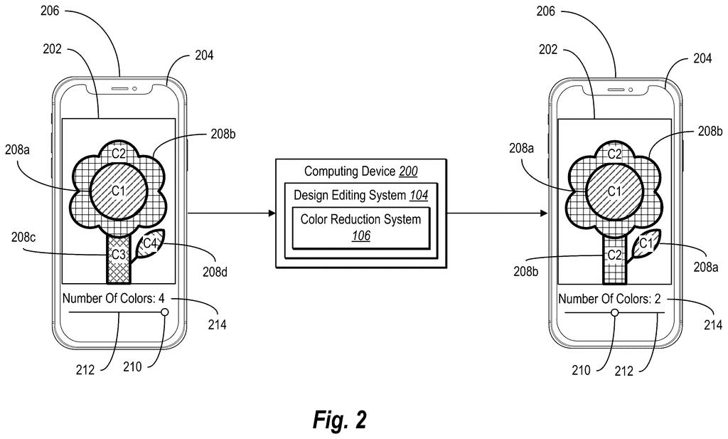
The tool works inside Adobe's design interface, so you can watch the artwork update live as you adjust. You stay in control of how many colors survive, and the system handles the math of grouping similar shades and assigning each shape to the closest keeper color.
This is squarely aimed at vector art, the kind of clean, scalable graphics used for logos, icons, and illustrations. Reducing the color count in vector files is a real production task, whether you're preparing assets for screen printing, simplifying a brand kit, or just tidying up someone else's messy file.
How the system picks which colors survive the cut
The patent describes a system built into a graphical user interface (think an Illustrator-style canvas) that can analyze a piece of vector artwork and extract its full color palette, meaning every distinct color value used across all the shapes in the file.
When a user signals they want to reduce that palette, the system determines a smaller subset of color values to keep. The filing mentions two key techniques for deciding which colors survive:
- Color clustering: grouping similar colors together (the way you might sort a pile of paint chips into rough families) and picking one representative color per group.
- Path dominance: weighing how much visual area each color covers, so colors that fill large shapes get priority over colors used only in tiny details.
The result is that every shape in the artwork gets reassigned to whichever surviving color is closest. The whole process is described as live, meaning the artwork on screen updates in real time as the user adjusts settings, rather than requiring a separate export or rendering step.
What this means for designers working with complex illustrations
Color reduction is a routine but time-consuming part of preparing illustrations for production. Screen printers, embroidery machines, and certain digital workflows all have strict limits on how many colors a design can use. Right now, designers typically handle this manually or with clunky workarounds. A live, in-canvas tool that does it intelligently would save real hours on real projects.
The path dominance angle is the interesting part here. A naive color-reduction tool just clusters shades mathematically; this one also accounts for which colors visually matter most in the composition. That's a meaningful difference: a tiny accent color and a dominant background color might cluster together mathematically, but you probably want to keep the background color, not the accent.
This is a practical, unsexy feature that working designers would actually use. It's not a research demo or a moonshot. The path-dominance weighting is a genuinely thoughtful touch that separates it from basic quantization tools, and the live-preview framing suggests it's built for real workflow integration rather than a one-shot batch process.
There are more where this came from
We read every patent application Big Tech publishes and send you the ones worth knowing. Plain English, free, every week.
The drawings
11 drawing sheets from US 2026/0212546 A1 · click any drawing to enlarge


Want this weekly breakdown for a company we don't cover? Patentlyze Pro →
Be the first to weigh in