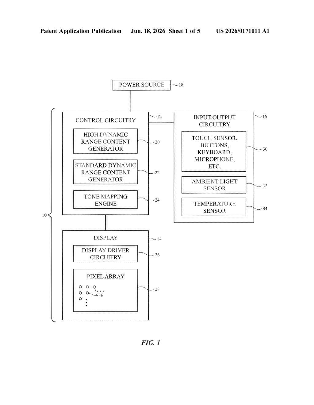
Apple Patents a Fix for Washed-Out Colors That Appear Next to Extreme Highlights
When a screen shows dazzling HDR highlights next to regular content, the regular parts can look dull and grayish by comparison — even if nothing is wrong with them. Apple's new patent describes a way to quietly fix that without dimming the HDR.
What Apple's locally boosted contrast actually does
Imagine watching a movie on your iPhone or Mac where one corner of the screen shows a blazing-white sun in an HDR clip, while the rest of the screen shows a normal interface or a standard-quality video. Your eyes adjust to the brightness of that HDR highlight, making everything else look flat and washed out — even if those other parts look perfectly fine on their own.
Apple's patent describes a system that detects where those HDR bright spots are and then slightly deepens the contrast of the surrounding standard content. Think of it like your screen quietly adding a little extra punch to the whites and darks right next to a bright highlight, so nothing looks muddy by comparison.
The size of each contrast-boosted zone isn't one-size-fits-all. The display adjusts it based on how big the HDR highlight is, how far you're sitting from the screen, and how much of the display is dedicated to HDR at that moment. Each boosted region can be a different size, tailored to the specific highlight it's sitting next to.
How the display calculates each contrast-boost region
Modern displays — particularly OLED and mini-LED panels — can show high dynamic range (HDR) content, which means genuinely brilliant whites and deep blacks in specific parts of the image. But many apps and videos mix HDR content with standard dynamic range (SDR) content on the same screen at the same time: think a bright HDR video thumbnail next to a regular UI, or a sports broadcast cutting between HDR replays and standard overlays.
The problem is a perceptual one. When your eyes are exposed to an intensely bright HDR highlight, the nearby SDR white content (which is technically fine) looks grayish and dim by comparison. Apple's patent tackles this with locally boosted contrast — small regions within the SDR portion of the screen where the display increases the contrast range, making whites look whiter and darks look darker, specifically in the zones adjacent to HDR highlights.
Critically, each boosted region is sized individually. The patent's first claim specifies that two different HDR highlights on the same screen can generate two differently sized contrast-boost zones around them. The system factors in:
- The size and shape of each HDR highlight
- The total size of the display
- How far the user is sitting from the screen
- What percentage of the display is running HDR at that moment
This means the correction is proportional and spatially aware — a tiny HDR badge in a corner gets a smaller boost zone than a large HDR video panel taking up half the screen.
What this means for everyday video and TV watching
Mixed HDR/SDR screens are increasingly common — every modern iPhone, iPad, and Mac already handles this scenario when you have HDR photos open alongside standard apps. Right now, the perceptual mismatch is real and noticeable if you pay attention to it. A system that intelligently adjusts contrast in real time, tuned to viewing distance and content layout, would make that experience feel more consistent without forcing everything into the same brightness mode.
For you as a viewer, the practical effect would be that standard content — email, documents, regular photos — simply looks correct even when sitting next to an eye-catching HDR highlight. It's the kind of fix that you'd never consciously notice when it works, but would definitely notice if it were absent.
This is a genuinely useful display engineering patent, not a flashy concept. The washed-out-whites problem is real and well-documented in display research, and Apple's approach of tailoring each correction zone independently to its adjacent highlight is more thoughtful than a blanket brightness adjustment. The patent is worth watching because it addresses a problem that affects every mixed-content screen Apple already ships.
Get one Big Tech patent every Sunday
Plain English, intelligent commentary, no hype. Free.
Editorial commentary on a publicly published patent application. Not legal advice.