
Apple's New Patent Filing Covers a Current-Time Marker for Smartwatch Notification Lists
Scrolling a long list on a tiny screen makes it easy to lose your place. Apple's filing fixes that with a small marker that pops up next to the rotating knob the moment you start turning it.
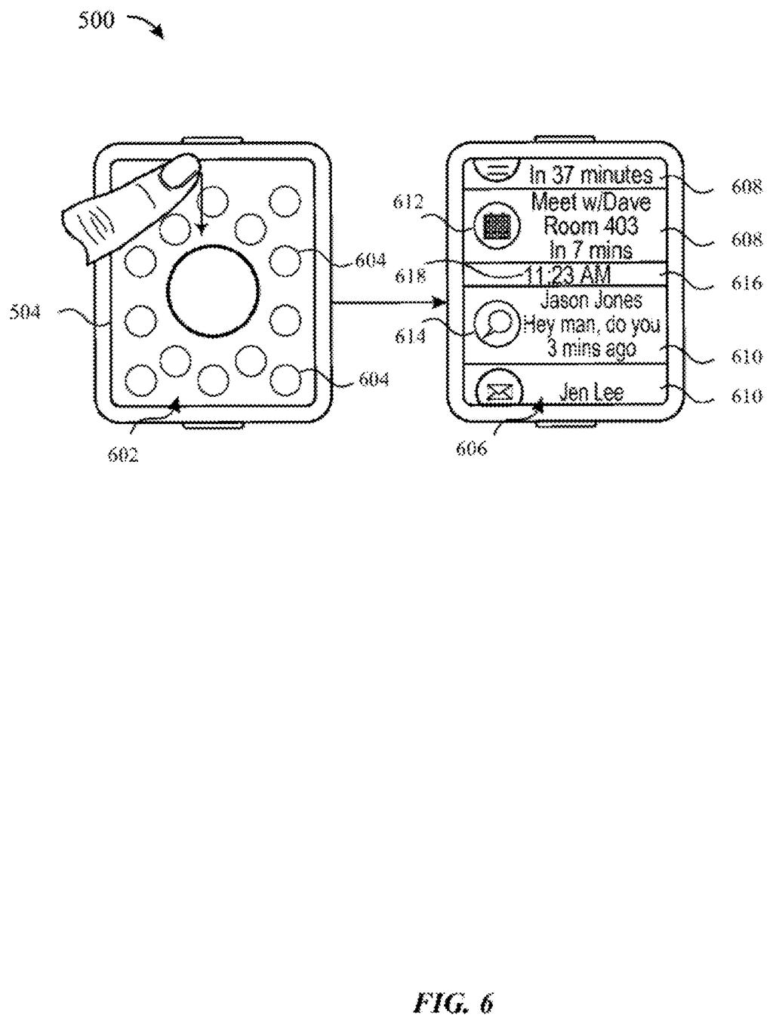
What Apple's scroll marker actually does
Imagine you're at a crowded airport and your wrist has buzzed all morning: a text, a calendar reminder, a weather warning, a gate change. You pull up the list of alerts on a tiny screen and start turning the small knob on the side to scroll. On a screen that small, it's hard to tell how far down the list you are.
Apple's filing says that as soon as you turn the knob, a position marker appears right beside it, showing where the notifications on screen sit within the full list. Stop turning for a moment and the marker fades away, so it doesn't clutter the display.
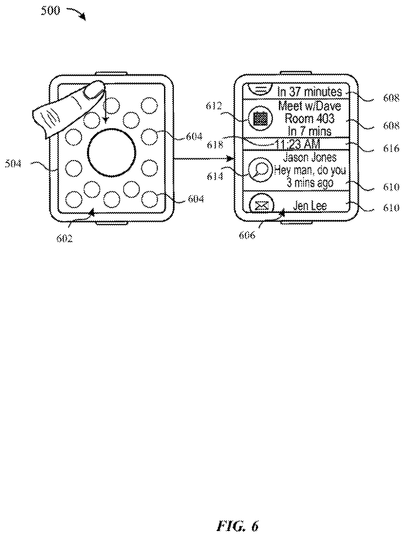
The description also lays out the alert list itself: upcoming items sit above a line showing the current time, and past items sit below it, with alerts from different apps mixed together in one place.
… a rotatable input mechanism that is physically rotatable relative to a housing of the electronic device and adjacent to the display …
Translation: This refers to a physical turning dial or crown on the side of the device casing.
How the marker follows the rotating knob
The claims describe a wearable device with a touch screen and a physically rotatable input mechanism (a knob that turns relative to the device's body) sitting next to the display. You open a screen tied to a set of content items, such as a list of notifications. Turning the knob scrolls that list by an amount that matches how far you rotated it.
The key detail is the scroll indicator. It was not on screen before you started turning, it appears while you scroll, and it is placed at a spot adjacent to the knob. Dependent claims say it can show your position in the list or what share of the list is currently visible, and that it can sit on top of the content. If you stop rotating for a set time, it fades out.
The filing describes several related touches:
- Touching the screen while turning the knob zooms the view.
- A firm press (the screen can sense how hard you push) brings up a button to clear the notifications.
- Tapping a notification opens its full content, and location-based alerts can be pinned to the top.
The description adds that the line showing the current time can stick to the top or bottom edge of the screen as you scroll, and tapping it refreshes the list. Swiping a notification sideways dismisses it.
… a future notification representing a future alert with a date and time after the current date and time, and a past notification representing a past alert with a date and time before the current date and time …
Translation: The list divides alerts into those happening later and those that already occurred.
What this means for your wrist alerts
The practical payoff is on your wrist. A screen that small shows only a few alerts at once, so a marker that tells you how deep into the list you are saves you from scrolling blind or overshooting past something you wanted. Because it appears only while you turn the knob, it takes up no screen space the rest of the time.
The filing is a continuation of an application first filed in 2015, which itself claims priority to 2014 provisional filings. Apple is still pursuing new claims in this family, and this round focuses on the knob and the marker instead of the past-and-future notification layout in the abstract. Think of it as polish on an alert list you may already use daily.
This is the 609th Apple filing in our Apple coverage since May, adding to work like room-based screen routing and app-picking voice control.
You would notice this the first time you scroll a long pile of alerts on a tiny screen and don't get lost. With only a few notifications visible at once, you can't otherwise tell whether you're near the top of three alerts or the middle of thirty.
Putting the marker beside the knob keeps your eyes close to the finger doing the turning. Fading it out after a pause keeps the screen clear when you're done, and since it only shows up when you start scrolling, it costs you nothing the rest of the day.
Expect it to feel routine in use. If it works, you won't think about it. If it were missing, you'd feel the gap every time you scrolled through a busy morning of messages.
Get our take in your Top Stories
Liked this breakdown? Add Patentlyze as a preferred source on Google, and our plain-English take shows up more often in your Top Stories the next time Apple patent news breaks.
There are more where this came from
We read every patent application Big Tech publishes and send you the ones worth knowing. Plain English, free, every week.
The drawings
45 drawing sheets from US 2026/0339485 A1 · click any drawing to enlarge


Show the other 37 sheets




Want this weekly breakdown for a company we don't cover? Patentlyze Pro →
Be the first to weigh in