Google Patents a Preview-Before-You-Commit Swipe Gesture for Suggestions
Imagine hovering over an autocomplete suggestion and seeing exactly what it would look like before you accept it — that's the core idea behind Google's latest UI patent.
What Google's contextual swipe gesture actually does
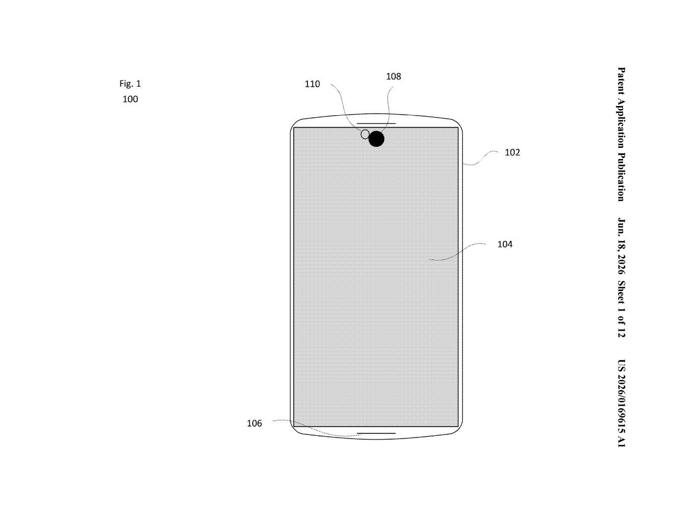
You know how your phone constantly offers suggestions — whether that's autocomplete words on a keyboard, search predictions, or quick-reply options in a chat? Right now, accepting one of those is usually a one-tap gamble. You tap, and whatever was suggested just appears.
Google's patent describes a system where your first gesture (say, pressing and holding, or beginning to swipe) triggers a live preview of what that suggestion would look like if you accepted it. You get to see the result before committing. Then a second, different gesture — like completing the swipe or tapping again — either confirms or dismisses it.
It's a bit like the "peek" gesture older iPhones had, but applied specifically to suggestion-based interfaces. The idea is that seeing a preview first gives you more control and fewer mistakes.
How the two-action gesture sequence generates previews
The patent describes a two-stage input method. A first user action — which could be a partial swipe, a long-press, or some other interaction with a suggestion in a list — causes the device to generate a visual preview of that suggestion's content. That preview is rendered on-screen so you can evaluate it before doing anything further.
A second user action, which must be different from the first, then determines what happens next. Depending on what that second gesture is, the system updates the displayed content accordingly — presumably either committing to the suggestion, dismissing it, or doing something else entirely.
The patent is intentionally broad, covering any kind of suggestion list on a computing device. That could mean:
- Keyboard autocomplete or autocorrect suggestions
- Search query predictions
- Quick-reply options in messaging apps
- Any other UI element that surfaces multiple choices
The two-action design is the key detail here. The first gesture is essentially a "show me" request; the second is the actual decision. This separation is what distinguishes it from a standard single-tap accept.
What this means for Android keyboards and search suggestions
For everyday Android users, this kind of UI could reduce the frustration of autocorrect swapping in a word you didn't want, or tapping the wrong search suggestion by accident. A preview step gives you a moment to course-correct before the action is final — which matters most on small touchscreens where precision is limited.
For Google, it fits a broader pattern of making AI-generated suggestions (from Gemini, Google Search, or Gboard) feel less risky to interact with. As suggestions become more elaborate — full sentences, generated replies, even composed emails — the stakes of blindly accepting one go up. A preview layer is a sensible UX response to that.
This is a modest but genuinely useful UX idea. The two-stage gesture concept solves a real problem that's gotten worse as AI suggestions have grown longer and more consequential. It's not a flashy patent, but it's the kind of interaction detail that, if it ships, you'd notice immediately and probably prefer.
Get one Big Tech patent every Sunday
Plain English, intelligent commentary, no hype. Free.
Editorial commentary on a publicly published patent application. Not legal advice.