Adobe Patents a Color Editor Where You Drag to Pick a Shade, Then Drag to Change It
Adobe is patenting a new way to edit colors in images — one where you drag across a graph to pick exactly which shades to change, then drag in a perpendicular direction to change them. It's a more tactile, visual take on the HSL color panel that photographers and video editors already live inside.
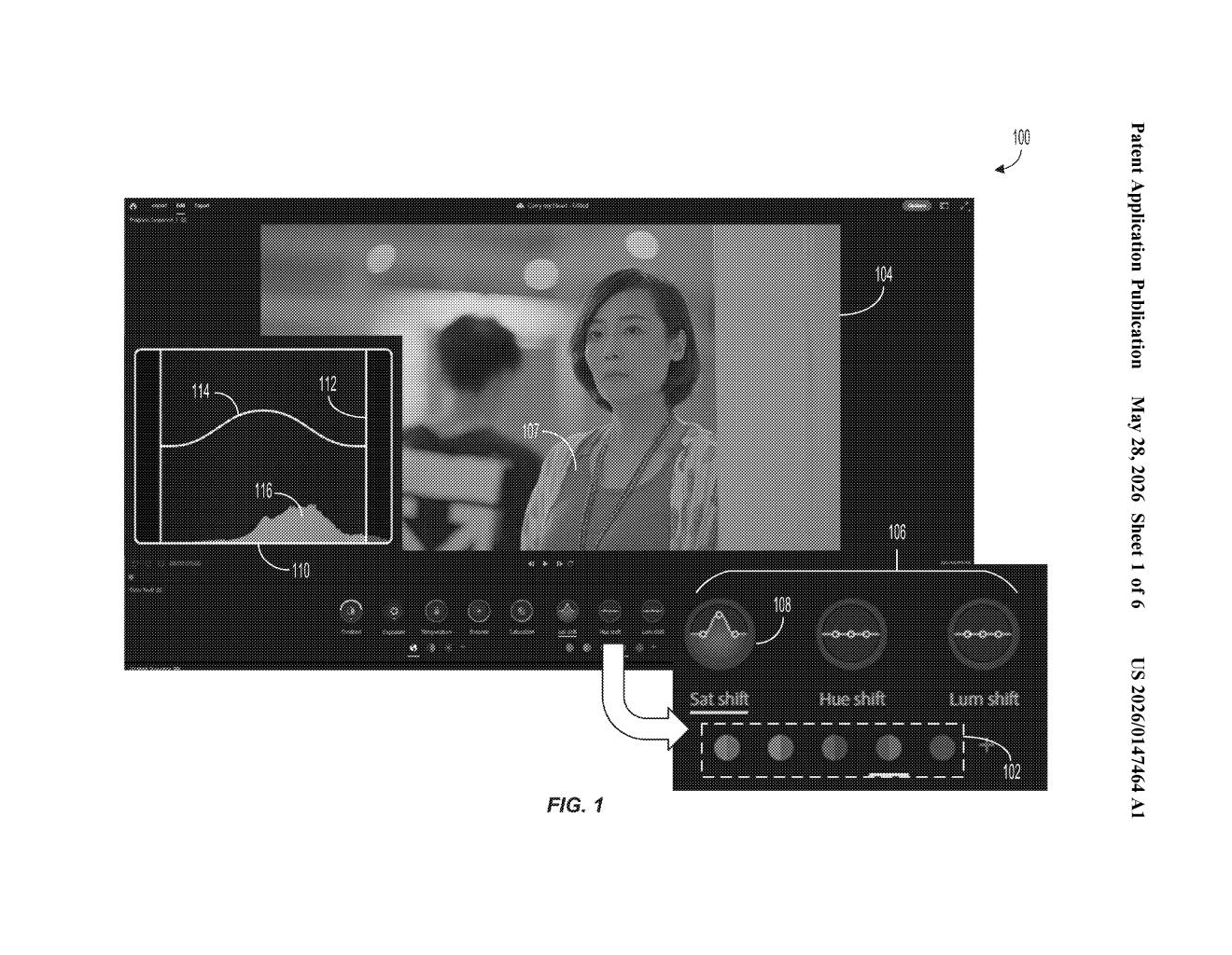
What Adobe's interactive HSL color graph actually does
Imagine you're editing a photo and the sky is a slightly muddy blue — you want to make just that shade of blue more vivid, without touching the turquoise in the water or the navy in someone's jacket. That's a surprisingly fiddly problem in most editing software today.
Adobe's patent describes an interactive graph that shows you the distribution of colors in a specific part of the spectrum — say, all the blues in your image. You drag along one axis to select which blues you want to target, then drag along a second axis to shift their hue, pump up the saturation, or brighten the luminance. The graph updates live as you work, so you can see the color distribution change in real time.
The whole idea is to make targeted color correction feel more like drawing than filling out a settings panel. Instead of typing numbers into HSL sliders, you're making visual gestures on a graph that responds to what's actually in your image.
How the two-axis graph selects and shifts colors
The patent describes a system that starts by breaking an image's colors into color sub-spectrums — essentially slices of the visible light spectrum, like "all the reds," "all the greens," and so on. For each sub-spectrum, the software builds an interactive graph that visualizes how frequently each color shade appears across the image's pixels.
The editing interaction is split across two axes:
- First axis (selection): You interact along one dimension of the graph to select specific colors within the sub-spectrum — for example, picking out a warm orange-red rather than a cool crimson.
- Second axis (adjustment): A separate interaction along the perpendicular axis modifies the hue, saturation, or luminance (HSL) parameters of those selected colors — HSL being the three knobs that control what color something is, how intense it is, and how bright it is.
Critically, the graph's color frequency distribution updates dynamically as you make adjustments — meaning the visualization reflects your edits in real time rather than showing you a static snapshot. The adjusted parameters are then applied to every pixel in the image that falls within the selected color range, and the corrected image is displayed on screen immediately.
What this means for photographers and video editors
For photographers and colorists, precise color selection has always been the hard part of HSL editing. Most tools give you broad preset color buckets ("Reds," "Oranges," "Yellows") that don't always match where a specific shade actually falls. A graph-driven approach that responds to the actual distribution of colors in your image could make fine adjustments — like isolating a specific skin tone or matching a brand color — significantly less painful.
This also fits Adobe's broader push to make Lightroom and Premiere Pro feel more intuitive and gesture-driven. If this surfaces in a shipping product, it would sit alongside tools like the existing HSL panel or color curves as a more tactile alternative for users who think visually.
This is a focused, practical UI patent — not a moonshot. Adobe is essentially trying to build a better mousetrap for a workflow that already exists and that their most engaged users already care deeply about. The live-updating frequency graph is the genuinely interesting bit; it turns a correction tool into something closer to a real-time visualization of what's in your image.
Get one Big Tech patent every Sunday
Plain English, intelligent commentary, no hype. Free.
Editorial commentary on a publicly published patent application. Not legal advice.