Google's New Patent Shifts AR Text Color Based on What Your Eyes Are Actually Focused On
Floating AR text looks sharp on screen, but your eyes often disagree — they're focused on the real wall behind the words, not the digital layer in front. Google's new patent tackles that mismatch by quietly shifting the color of virtual content based on depth.
What Google's depth-aware AR color system actually does
Imagine you're wearing AR glasses and a notification pops up right in front of a wall five feet away. Your eyes naturally want to focus on that wall, but the virtual text is set to appear at a different depth. The result is a subtle visual tension — your eyes have to keep switching focus, which gets tiring fast.
Google's patent proposes a fix: automatically adjust the color of virtual content based on two things — how far away the digital image is meant to appear, and how far away the real-world surface behind it actually is. The bigger the gap between those two distances, the more the system tweaks the color to help your eyes reconcile the difference.
It's a bit like how a good cinematographer adjusts lighting to make a foreground subject feel like it belongs in the same scene as the background. Here, the display is doing that work in real time, for your eye muscles, without you noticing.
How the display measures two distances to pick a color
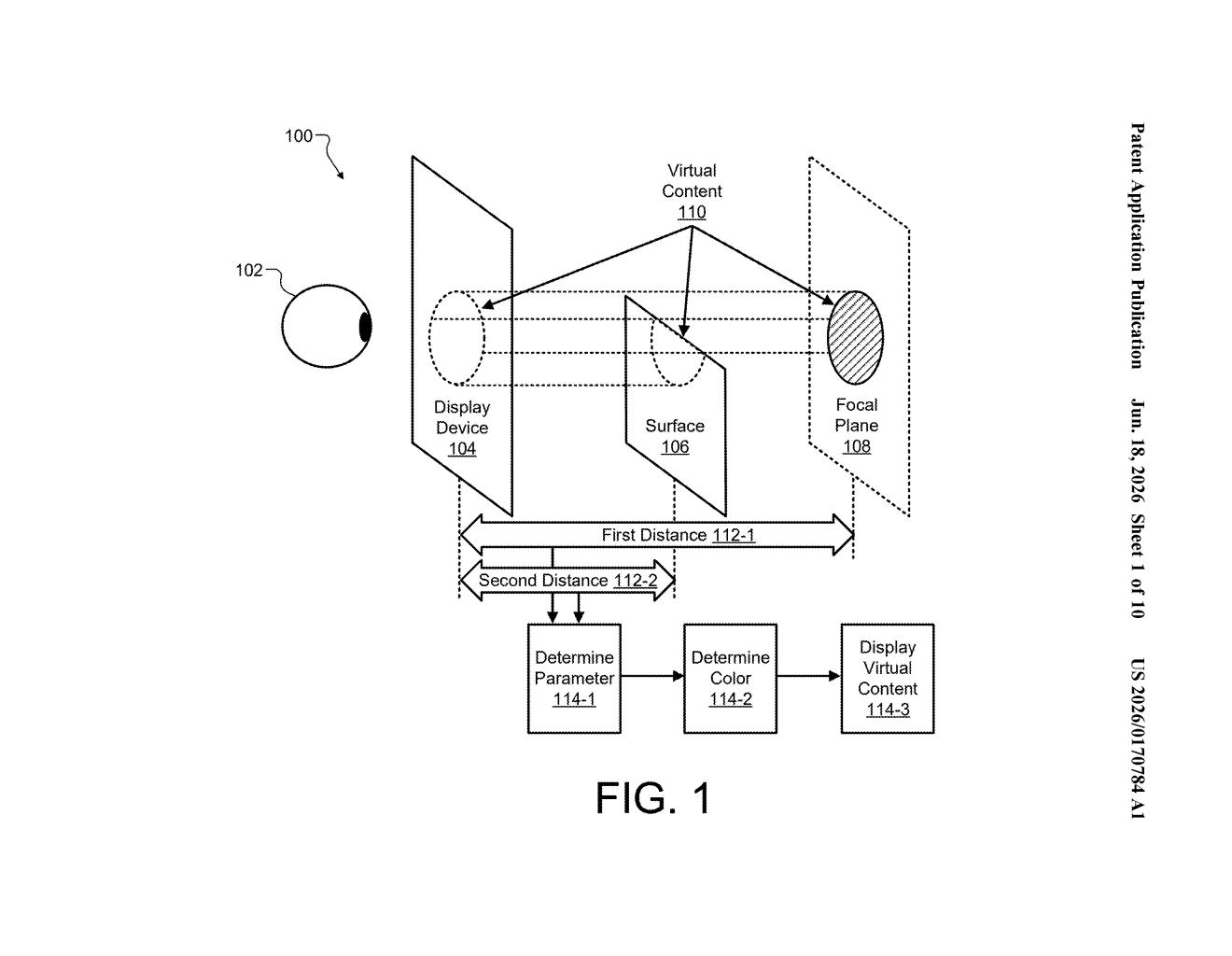
The patent describes a display system — think AR glasses or a headset — that continuously measures two distances: the focal plane distance (where virtual content is set to appear in space) and the surface depth (how far away the real-world object visible behind or around that content actually is).
Using both numbers, the system computes a characteristic for the virtual content — most concretely, its color. The idea draws on a well-known property of human vision called chromostereopsis: different colors appear to sit at slightly different depths to the eye, even when they're displayed on the same flat plane. Warm colors like red tend to look closer; cool colors like blue tend to look farther away.
By choosing a color that nudges the apparent depth of the virtual content toward the depth of the real surface the viewer is likely fixating on, the system reduces the mismatch between where the eye is focused and where the display is rendering. This closes a gap known as the vergence-accommodation conflict — a core discomfort problem in almost all current AR and VR hardware.
The process runs on the display device itself and applies per-piece-of-content, so different virtual elements in the same scene could get different color treatments depending on what's behind each one.
What this means for wearing AR glasses all day
The vergence-accommodation conflict is one of the biggest reasons AR glasses make people's eyes hurt after extended use — and it's notoriously hard to solve in hardware without making headsets much heavier and more expensive. A software-level color adjustment that partially compensates for depth mismatches is a cheaper path that could ship on existing displays.
For you as a future AR glasses wearer, this is the kind of invisible feature that determines whether you can wear a device for an hour or all day. Google has been building AR and mixed-reality hardware for years, and a patent focused on per-content color adaptation suggests the company is thinking seriously about long-session comfort — not just wow-demo moments.
This is a genuinely interesting patent because it attacks a real physiological problem — eye fatigue from depth conflicts — with a software trick rather than exotic optics. The chromostereopsis approach won't fully replace hardware solutions, but if it reduces discomfort meaningfully in practice, it's the kind of low-cost quality-of-life feature that separates good AR glasses from ones people return after a week.
Get one Big Tech patent every Sunday
Plain English, intelligent commentary, no hype. Free.
Editorial commentary on a publicly published patent application. Not legal advice.