
Microsoft Patents an AI That Writes the Code Behind Your Data Charts
Every time a data analyst wants to visualize a new cut of their data, they have to write transformation code by hand. Microsoft's new patent describes an AI that does that writing, testing, and filtering automatically before a single bar or line appears on screen.
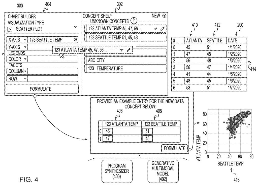
What Microsoft's AI chart-builder actually does for you
Every time you try to turn a spreadsheet into a chart, someone has to wrangle the data into exactly the right shape first. Dates get reformatted, totals get calculated, categories get grouped. That wrangling is usually manual, and it is where most of the time goes.
Microsoft's patent describes a system where you describe the new data angle you want in plain English, and an AI generates several possible ways to compute it. Each candidate approach is tested on real sample data, and any that produce broken or nonsensical results are automatically thrown out. What remains is shown to you alongside the code used to produce it, so you can see exactly what the AI did.
The cleaned-up result is then plugged directly into a chart, mapped to the right visual element: a color scale, an axis, a size. The goal is to shorten the gap between "I want to see X" and "here is X as a chart" without requiring you to write a line of code yourself.
… generating a new data concept by transforming an existing data concept from the plurality of data concepts using at least one of a program synthesizer or a generative machine learning model …
Translation: The system creates new data points by using AI or code-writing tools to modify information you already have.
How the AI generates, tests, and filters data transforms
The patent centers on what it calls data concepts: named groupings of related values inside a dataset, think of them as columns or derived fields that carry meaning. The system takes an existing data concept and, following a natural-language prompt from the user, tries to create a new data concept derived from it.
To do that, it uses either a program synthesizer (a rules-based engine that constructs code from a grammar of known operations) or a generative machine learning model (an AI, similar in kind to a large language model, that writes code from a description). The generative path works like this:
- The user's plain-English prompt is sent to the generative model.
- The model returns a batch of candidate data transformations, each expressed as executable code.
- Each candidate is run against sample values from the existing data concept.
- Candidates that produce invalid outputs are filtered out automatically.
- For each surviving candidate, the system shows both a sample result and the code segment that produced it, giving the user full visibility into what happened.
Finally, the new data concept is mapped to a visual channel of the chart. A visual channel is a property of a visualization: the x-axis position, the y-axis position, color, size, or shape. Deciding what data drives which channel is the core act of chart design, and the patent claims this mapping step as part of the automated pipeline.
The two-path approach (rules-based synthesizer or generative model) appears designed to hedge: the synthesizer is more predictable; the generative model handles open-ended requests the synthesizer cannot anticipate.
A new data concept for the visualization is generated by transforming an existing data concept using a program synthesizer and a generative model.
Translation: The software builds new chart data by combining automated code generation with artificial intelligence.
What this means for everyday data and business software
For anyone who works with data but is not a programmer, the friction of getting from a question to a chart is real. Tools like Excel, Power BI, and Tableau have reduced some of that friction over the years, but deriving new computed fields still usually means writing formulas or query code. A system that can draft and validate that code from a sentence, and then wire the output directly into a visualization, would meaningfully widen who can do serious data analysis.
For Microsoft specifically, this sits squarely inside its Copilot push across the Office and Power Platform suite. Power BI and Excel are both obvious homes for this kind of capability, and the patent's emphasis on showing users the underlying code aligns with Microsoft's stated transparency goals for its AI tools. The latest Big Tech patents in the data-visualization space show a clear race to own the "natural language to chart" workflow, and Microsoft's filing staking out the transform-generation and validation step is a concrete position in that race.
This is the fourth Microsoft filing we've tracked since July on our AI agents that act for you watchlist, following one on learning by watching and one on plain English database queries.
Claim 1 is specific enough to be meaningful but broad enough to be consequential. It covers the full pipeline: natural-language prompt in, candidate code generated, candidates run on sample data, bad ones filtered, survivors shown with their code, result mapped to a visual channel. That is not a patent on "AI makes charts" in the abstract; it is a patent on a particular generate-test-filter loop applied to data transformation for visualization purposes. The breadth that matters is the filtering step combined with the code-transparency requirement.
If granted, this claim could apply to any system that generates multiple data-transformation candidates from a prompt, tests them automatically, and shows the surviving code to the user before rendering a chart. That describes a workflow any serious business intelligence tool might want to implement.
The weakest point for granting is prior art. Program synthesis for data transformation and AI-assisted chart authoring have both been active research areas for years, with published academic work that predates this filing. The claim's combination of those ideas with automatic validity filtering and code display may be novel as an integrated system, but the examiner will have real work to do on that question.
Get our take in your Top Stories
Liked this breakdown? Add Patentlyze as a preferred source on Google, and our plain-English take shows up more often in your Top Stories the next time Microsoft patent news breaks.
There are more where this came from
We read every patent application Big Tech publishes and send you the ones worth knowing. Plain English, free, every week.
The drawings
12 drawing sheets from US 2026/0252541 A1 · click any drawing to enlarge


Want this weekly breakdown for a company we don't cover? Patentlyze Pro →
Be the first to weigh in