
Apple Patents a Display That Dims Differently Depending on What You're Watching
Apple is patenting a display system that doesn't just fade to black the same way every time. Depending on what's on your screen when your phone goes idle, you'd see a completely different transition animation into the low-power state.
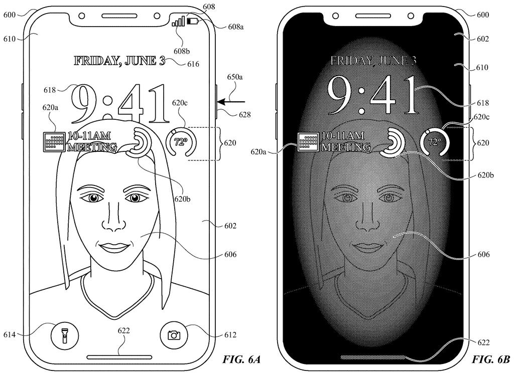
What Apple's context-aware screen dimming actually does
You're watching a video and your phone decides it's time to dim the screen. Or you're mid-way through reading an article. Either way, your screen goes dark. Right now, that fade-out looks pretty much the same no matter what you were doing.
Apple's new patent filing describes a system that pays attention to what is on screen before it dims. If you're in one type of app or interface, the phone plays one kind of transition animation as it shifts to low-power mode. If you're in a different type, it plays a different animation entirely, landing on the same dimmed screen but taking a different visual path to get there.
The goal is that the transition feels appropriate to your context rather than jarring or generic. It's a small detail, but Apple has long treated these micro-moments as part of the overall feel of a product.
… transitioning the computer system from the first mode to a second mode which is a lower power consumption mode for the display generation component of the computer system than the first mode …
Translation: Switching the device to a power-saving mode that uses less electricity for the screen.
How the system picks which animation to play on dim
The patent describes a computer system (a phone, tablet, or similar device) that monitors what kind of user interface is active when it detects a trigger to enter a lower-power display mode, like when your screen is about to dim after a period of inactivity.
The key mechanism is a branch: the system checks whether the current screen belongs to type one or type two of user interface. Based on that check, it fires one of two different animations. Both animations end at the same destination, a second user interface displayed in the lower-power mode, but the path getting there looks different depending on where you started.
- If the screen matches the first interface type, it plays animation A on the way to the dimmed state.
- If it matches the second type, it plays animation B instead.
The patent's claim language stays deliberately broad about what counts as "type one" or "type two" and what exactly differentiates the two animations. That breadth is typical for foundational UI patents, letting the underlying principle cover many specific implementations Apple might build on top of it.
What this means for everyday iPhone and iPad screen behavior
For most people, this would show up as a screen transition that feels slightly more polished or less abrupt, the kind of thing you notice on first use and then stop noticing, which is actually the point. A jarring cut-to-black from a media app feels different from the same cut while you're reading. A tailored animation softens that break.
Apple's interest in display power management shows up in multiple recent filings, and this one fits a broader effort to make power-saving behavior feel intentional rather than utilitarian. Whether that translates into something visible in a future iOS update or stays as a building block for something else is an open question.
Apple's 497th filing in our Apple coverage since May adds to a run that includes synced multi-camera work and safe device handoffs.
From a pure user-impact standpoint, this patent is about eliminating a small moment of friction you probably didn't know was bothering you. The screen dims, and instead of a generic fade, something appropriate to your context happens. That's not nothing, especially on a device you look at hundreds of times a day.
That said, the patent is written so broadly that it's hard to know how much visual difference a real implementation would actually produce. Two animations that both lead to the same dimmed screen could be subtly different or dramatically different. The patent protects the concept either way.
For Apple, it reads like housekeeping for the display layer, securing the idea that context should inform transitions, and leaving room to build more specific behaviors on top later.
There are more where this came from
We read every patent application Big Tech publishes and send you the ones worth knowing. Plain English, free, every week.
The drawings
48 drawing sheets from US 2026/0301710 A1 · click any drawing to enlarge


Want this weekly breakdown for a company we don't cover? Patentlyze Pro →
Be the first to weigh in