
Apple Patents a Display System That Adjusts Colors for Color-Blind Users
About 300 million people worldwide have some form of color vision deficiency, and Apple is patenting a pixel-level approach to making screens look right to them.
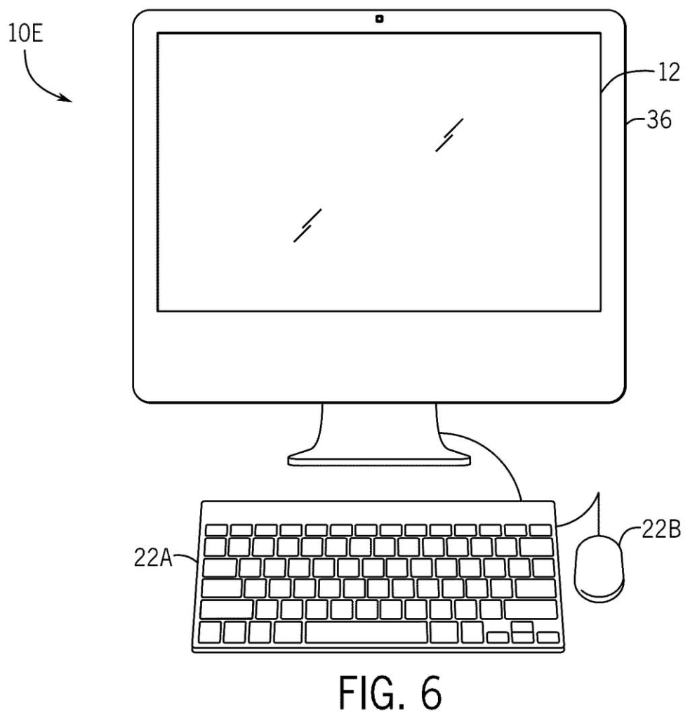
How Apple's color-correction display filter actually works
Every time a color-blind person looks at a photo on their phone, some of the colors they see are wrong. Reds and greens may blend together, or blues and purples may look identical. That's not a software setting they can fix from a menu. It's a biological difference in how their eyes process light.
Apple's patent describes a system that examines each individual pixel before it's shown on screen and shifts its colors based on a classification of what kind of color that pixel represents. The goal is to make the image look more like what a person with full color vision sees, without washing out or distorting the picture for everyone else.
This goes deeper than the basic color filter options already available in iPhone's accessibility settings. Instead of applying a blanket color shift to the whole screen, it works pixel by pixel, making targeted adjustments based on how each color is constructed.
… generate adjusted image data by modifying one or more of the color components based at least in part on the classification.
Translation: It alters specific color values so the image is easier for a color-blind person to see.
How the algorithm classifies and shifts each pixel's color
The patent describes processing circuitry (the chips inside a device that handle image rendering) that analyzes each pixel's three color components: a maximum, a middle, and a minimum value across the red, green, and blue channels.
Using those three values, the system assigns the pixel to a classification. Think of it like sorting crayons into groups: warm reds, cool blues, muted grays, and so on. Once a pixel is classified, the system modifies one or more of its color components to shift the apparent color toward something more distinguishable for someone with a color vision deficiency.
The approach is notable because it operates at the individual pixel level rather than applying a global transformation to the full image. A blanket color filter (like inverting greens or boosting reds across the entire screen) can make some colors clearer while making others worse. A per-pixel classification system can, in theory, apply the right correction to the right part of the image at the right time.
- Receives raw pixel color data (the red, green, blue values for each dot on screen)
- Identifies the maximum, middle, and minimum color components
- Assigns a classification to the pixel based on those values
- Adjusts one or more components to produce corrected output
What this means for iPhone users with color vision differences
For someone with red-green color blindness, a traffic light graphic, a map legend, or a health app's warning indicators can be genuinely hard to read on a phone. Current accessibility tools in iOS offer color filters, but they apply to everything on screen at once, sometimes helping in one area while creating problems in another. A per-pixel system could make those everyday friction points go away without anyone else at the table noticing a difference.
The practical payoff here is subtle but real: color-blind users would stop having to mentally compensate for what their phone is showing them. new Big Tech patents in the display and accessibility space increasingly show Apple pushing color science deeper into hardware, and this filing fits that pattern.
That makes this Apple's 31st filing in display patents we cover since May, a list that includes one on ceramic foldable screen covers and one on rear camera subject screens.
For someone who has trouble telling red from green, a photo of a salad or a traffic light on a map can be confusing in ways that are hard to explain to people who don't share the problem. What this patent describes is a system that looks at each individual dot of color on a screen and shifts it toward something more readable, without washing out the image for everyone else.
The reason that matters is precision. A broad color filter applied to an entire screen can clarify one thing while muddying another, so a sunset looks wrong while the chart finally makes sense. Correcting color at the pixel level means the adjustment shows up exactly where it's needed and stays invisible everywhere else.
Most people using this would never think about how it works. They would just notice that their phone finally shows them what everyone else sees.
Get our take in your Top Stories
Liked this breakdown? Add Patentlyze as a preferred source on Google, and our plain-English take shows up more often in your Top Stories the next time Apple patent news breaks.
There are more where this came from
We read every patent application Big Tech publishes and send you the ones worth knowing. Plain English, free, every week.
The drawings
26 drawing sheets from US 2026/0253187 A1 · click any drawing to enlarge


Want this weekly breakdown for a company we don't cover? Patentlyze Pro →
Be the first to weigh in