
Apple Patents a Health Chart That Shows How You Felt Both in the Moment and Overall
Your mood right now and your mood looking back at the whole day often feel like two different things. Apple has filed a patent for a health chart designed to show both readings at the same time, without one erasing the other.
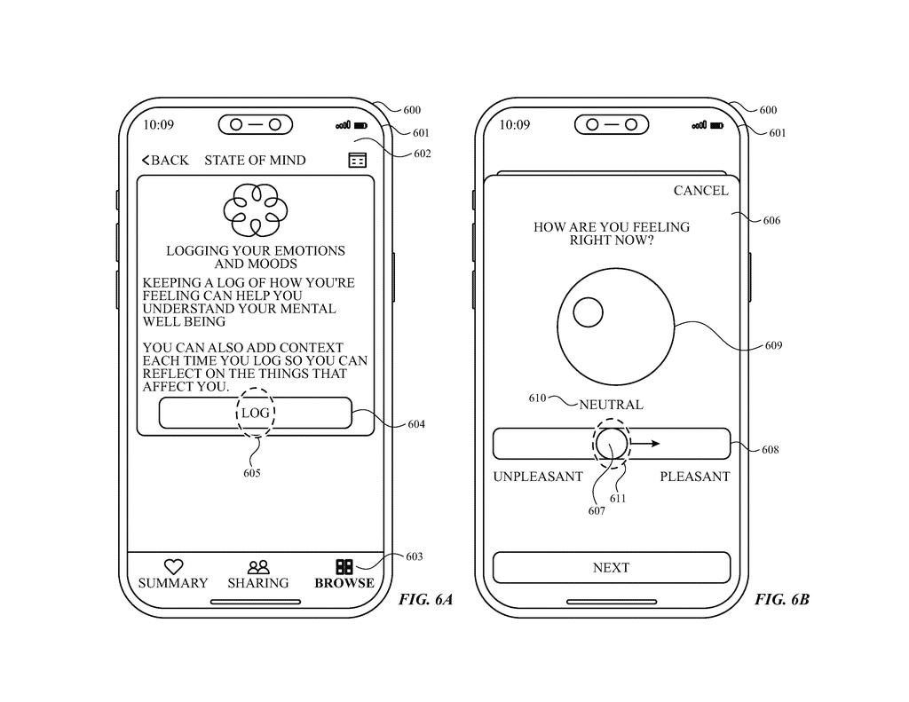
What Apple's mood-tracking chart actually shows you
Imagine you're reviewing your week in an Apple health app and you want to know: did Tuesday actually go well, or does it just feel that way now? The tricky part is that how you felt in a specific moment and how you'd rate the whole day in hindsight are genuinely different data points, and most charts can only show one at a time.
Apple's patent describes a chart that holds both readings inside the same block of time. A single visual entry for, say, Tuesday would carry one indicator for a logged moment during that day and a separate indicator for your overall rating of the entire day. You see both without flipping between screens.
This is the kind of interface detail that sounds minor until you're actually trying to spot patterns in your own emotional life. Whether a bad moment dragged down your whole day, or a rough day had some genuinely good stretches, becomes something the chart can actually show you.
displaying, via the display generation component, a first chart indicating a plurality of emotional valence values logged for a time period, wherein the first chart includes: a user interface object representing a sub-time period of the time period …
Translation: The screen shows a graph of your mood over a specific timeframe using visual markers.
How the chart layers two emotional ratings in one view
The patent describes a chart interface designed to display what Apple calls emotional valence data (a clinical term for how positive or negative a feeling is, on a scale). The chart covers a selected time period and breaks it into sub-periods, such as individual days within a week.
Inside each sub-period block, the interface shows two distinct indicators:
- A moment-level rating: how the user felt at a specific logged moment during that sub-period
- A period-level rating: how the user rated their overall emotional state across the entire sub-period
These two values can differ from each other, and the chart is specifically built to surface that difference rather than averaging them into a single number. A user might log a low mood mid-afternoon but give the day a higher overall rating, and the chart would show both without collapsing them together.
The system is described as running on a computer communicating with a display component, which fits the profile of an iPhone, iPad, or Apple Watch paired interface. The logging itself appears to rely on user input rather than passive sensor data, though the patent focuses on the display layer rather than how the data is collected.
The present disclosure generally relates to techniques and user interfaces for logging and/or interacting with health information.
Translation: This patent covers new screen designs for tracking and viewing your health data.
What this means for mental health tools on Apple devices
Mental health tracking in consumer apps has a real credibility problem: a single number per day flattens everything, and people know it. If Apple is building a chart that preserves the difference between how you felt at 2 p.m. and how you'd rate the whole day, that's a meaningful step toward interfaces that treat emotional data with more honesty. Both Apple Health and the mental health logging features introduced in recent watchOS versions would be natural homes for something like this.
For you as a user, it could make a real difference when you're trying to understand patterns over weeks or months. A chart that shows a rough Tuesday afternoon alongside a positive overall Tuesday rating tells a richer story than one number ever could. Whether Apple builds this in a way that feels natural to interact with daily is the open question.
Apple's 11th filing we've tracked since May in our health sensor patents watchlist follows earlier applications like one flagging heart and diabetes risk and one personalizing audio to hearing tests.
Capturing mood twice in one day, once in the moment and once recalled later, gives the chart more information but also more clutter. A complicated week produces a complicated picture, and that cost is only worth paying if the two readings are visually distinct enough to tell apart at a glance, which the patent does not explain.
The deeper bet here is that a single daily mood score is too simple to be honest. Psychologists have long known that how you feel right now and how you remember feeling later can land on meaningfully different numbers, and collapsing them hides something real.
But if those two indicators blur together on a small screen, the added complexity becomes friction rather than insight, and people will stop logging altogether. That failure mode is predictable enough that it deserves a clear design answer, and this document does not yet provide one.
There are more where this came from
We read every patent application Big Tech publishes and send you the ones worth knowing. Plain English, free, every week.
The drawings
27 drawing sheets from US 2026/0299765 A1 · click any drawing to enlarge


Want this weekly breakdown for a company we don't cover? Patentlyze Pro →
Be the first to weigh in